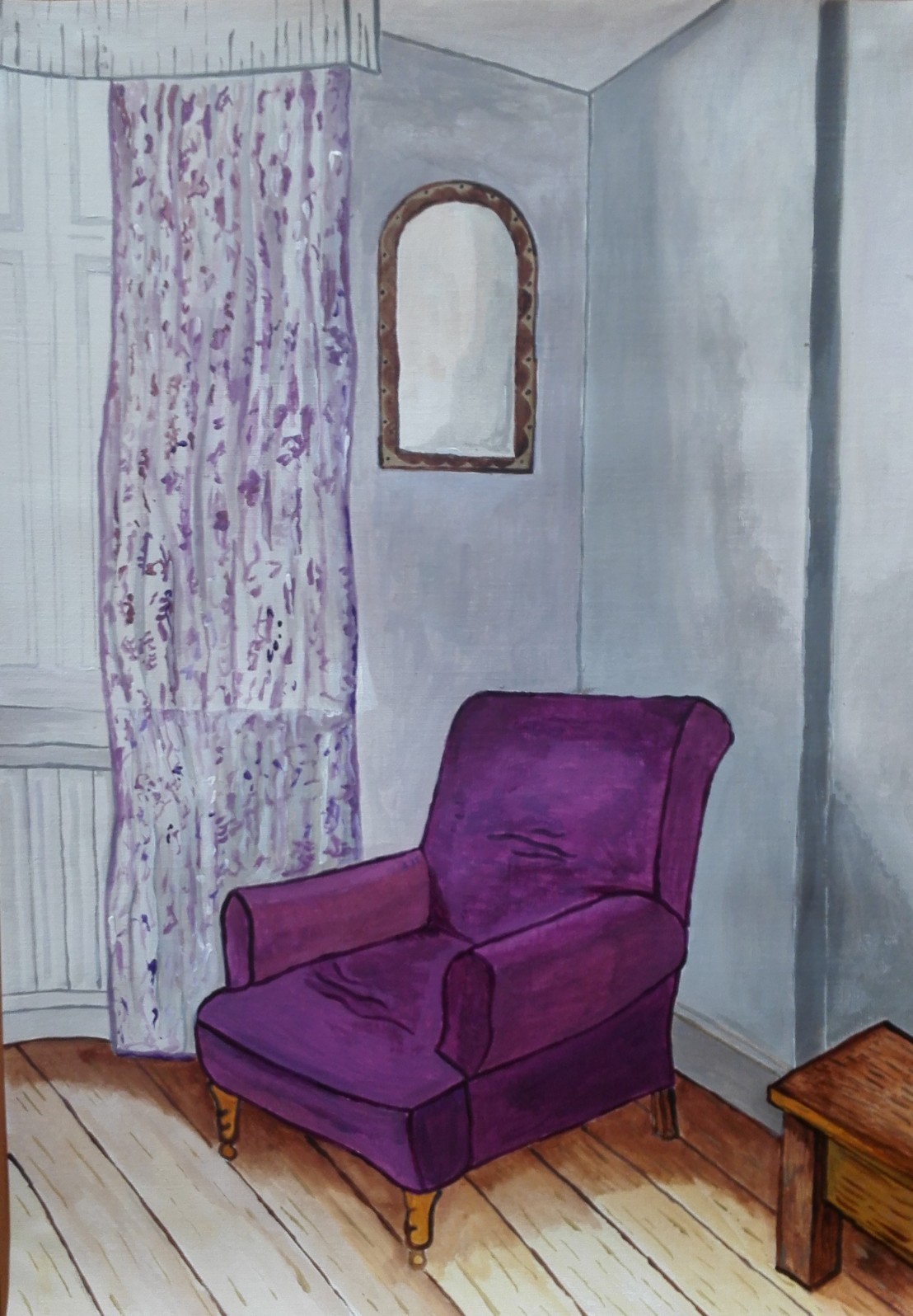
For this exercise I chose a slightly different viewpoint from one of the sketches that I had made for the previous exercises. I raised the viewpoint slightly by using a higher chair and also moved the viewpoint outwards to give more information and to better locate the chair in its place in the room.
I started with a very quick sketch and made notes.
I decided to use an A3 acrylic paper and chose not to create a ground. First step was to draw the main lines to try to get the perspective correct. This was followed by a more detailed drawing onto which I would paint directly. I first painted the outline of the chair and then moved around the painting creating lines close to the colour I expected to use. Despite this being an exercise in line and perspective I still felt the need to try to create a painting that tried to show some feeling and light.
I completed the painting and after some consideration made some small adjustments to a few lines. The final painting is below. I feel that I have met the brief of the exercise and also created a painting that looks convincing. However there are a couple of sections where the perspective looks slightly off. The main section where I feel this occurs is the small table on the lower right hand side.
I decided to make a series of sketches of our living room. For the first four I stood in a central position a faced the four corners of the room. For each sketch I tried to keep the time spent to approximately 15 minutes.
The four sketches are shown below.
Facing the Television
Facing the TV chair
Facing the kitchen door
Facing the rear end
I then proceeded to make sketches of these four views but this time from a seated position. I found it a lot more comfortable to draw sitting down and was able to support the sketch book better. The four sketches are shown below.
Facing the television
Facing the TV chair
Facing the rear of the room, left side
Facing the rear of the room, right side
I think some of the sketches have some merit and there are possibilities for further examination of the subject matter. There are some perspective issues with some of the sketches. This could be corrected by taking more time. I feel that the two that work best are the simple views of the TV chair. I will have to decide whether there is sufficient interest to use this view for the next exercise on line. The sketches that I am least happy with are the final two, looking towards the back of the room. The first has multiple perspective problems. I added a line to suggest a corner that isn’t present. This helped to bring the two cabinets together. The cabinets themselves are a strange shape, we refer to them as ‘The Mummies’. Hopefully my sketches confirm the reason why they have this name. I will look to avoid this complexity for the next exercise. The other sketch of the table and chairs suffers again from perspective issues and also the composition is not interesting.
I will remind myself on ‘Perspective’ in Research point 5 before embarking on the Exercise – Simple perspective in interior studies for which I will have to decide on which view to go for or perhaps a new one.
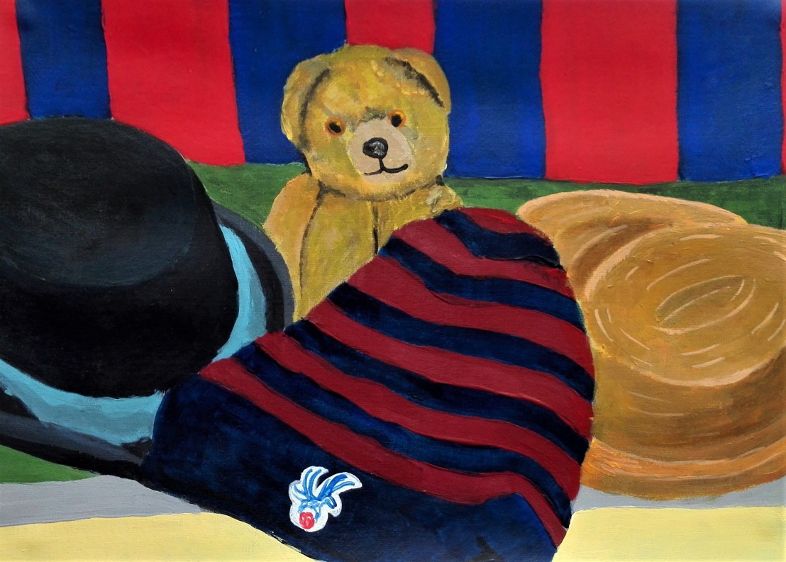
The first challenge for these three exercises was to find and set up a still life that I would find interesting and challenging. Additionally it had to be able to fulfil the constraints and demands of the exercises itself. I struggled a little to find a suitable subject before finally coming up with the idea to arrange three hats, a teddy bear and a football scarf.
I tested the final composition by making a quick sketch but didn’t feel that the set up was quite right.
I re-arranged the set-up into the composition below and made another quick sketch to test it.
I was reasonably happy with the composition and commenced on the first exercise which was to paint the still life and try to recreate the colours as precisely as possible. I set out to complete this exercise and the subsequent two using acrylic paints. I believe that some of the problems that I encountered would not have been as acute with oil paints.
I have to admit that I found achieving the precise shades of colour quite difficult. This was especially true of the bright red and blue in the scarf. I noticed that the colour on the palette was different when it had dried on the paper. The sheen and the intensity of the colour dulled. I tried to brighten the colours with the addition of white however this only reduced the intensity. My only solution was to use the colour as purely as possible straight from the tube and to overpaint so as to build up a solid colour. The broken or tertiary colours were easier to achieve although I again was confronted with the problem of the dried colour being different from that mixed on the palette.
The exercise stated not to be concerned with scale and perspective. I found these difficult to ignore and ended up creating the painting below. I feel overall that the colours are a reasonable representation of the true colours.
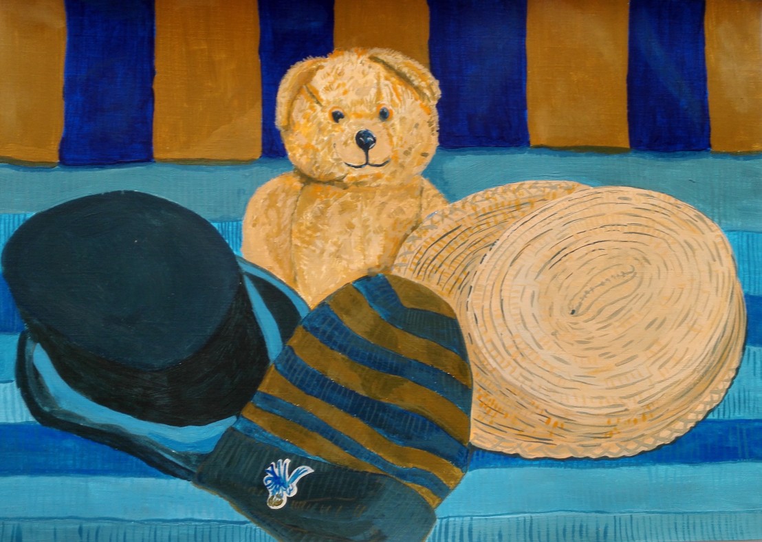
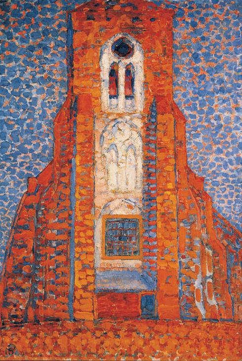
The second exercise was to paint the same still life but only using two complimentary colours. The colours I chose were Windsor Blue and Cadmium Orange. The choice of colours was partly dictated by the strong blue in the scarf and hat, but also by reference to the research I had undertaken optical effects. The painting by Piet Mondrian, Sun Church in Zeeland was painted using similar colours.
Sun, Church in Zeeland; Zoutelande Church Facade 1909-10 Piet Mondrian 1872-1944 Purchased with assistance from the National Lottery through the Heritage Lottery Fund, the Kreitman Foundation, the Art Fund and the Friends of the Tate Gallery 1997 http://www.tate.org.uk/art/work/T07328
Whether I would be able to achieve a similar effect was doubtful but I pressed on. The painting below is the result. I am happy with the contrasts and the range of different hues that I was able to achieve. I am less happy how some of the colour is subdued and feel that perhaps I should have used the orange straight from the tubes a little more. I think that this may have added more drama to the work.
The third and final exercise was to paint the Still life again but this time to try to evoke mood. For this I decided that I would paint mainly using palette knife and try to use the paints straight from the tube mixing only on the paper. I used paper on which I had previously made a yellow ground. In the final painting only a tiny amount of the ground remains. The decision to use palette knife was to try to move me away from being too precise with line. The mood I was trying to evoke was a naturalistic look with a dirty feel. I think the resulting painting achieves this goal.
In summary I’m happy with my paintings for these three exercises and feel that they meet the requirements of the briefs. Most importantly they have forced me to challenge myself and my use of colour to describe a Still life composition.
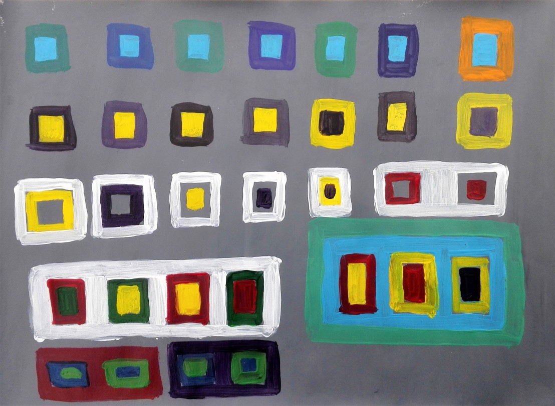
For the start of these exercise I experimented with a range of different colours and contrasts. I used my cheapest acrylic paints which were a little lacking as their coverage was poor. However I was still able to observe how the colours interacted with each other. The contrasts were most dramatic when two complementary colours were set against each other. The purer the colours the more dramatic the contrast.
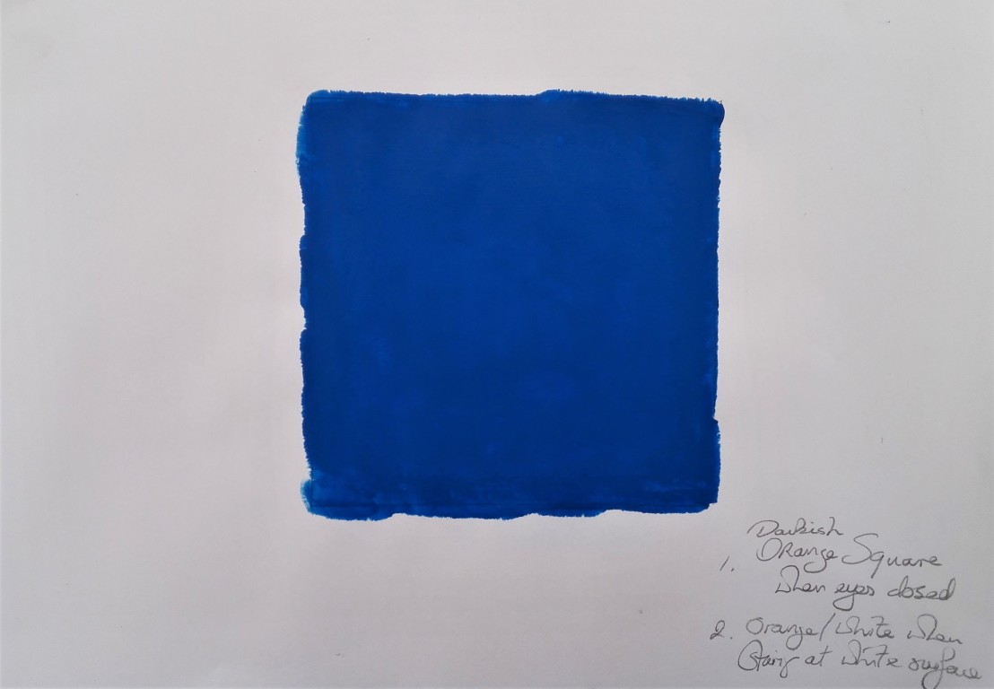
For the second of these exercises I created a square of cobalt blue and observed the effect of the optical impact of staring at the square for 30 seconds and then first closing my eyes and secondly staring at a white sheet of paper. In the first instance a darkish orange square was observed and in the second instance an orange / white image. Orange being the complementary colour of blue.
Having paint left on my palette I proceeded to paint a couple of A4 size abstract paintings the first didn’t really work and the contrasts and the marks are poor and ill defined. For the second I painted rectangular shapes of colour. The resulting painting gas hints of Mondrian.
This lead me to look at other works by Piet Mondrian and I was particularly taken by a work called ‘Sun, church in Zeeland’. The painting is made using two complementary colours orange and blue. The paint is laid down in slabs. A warm feeling is created, the church glows.
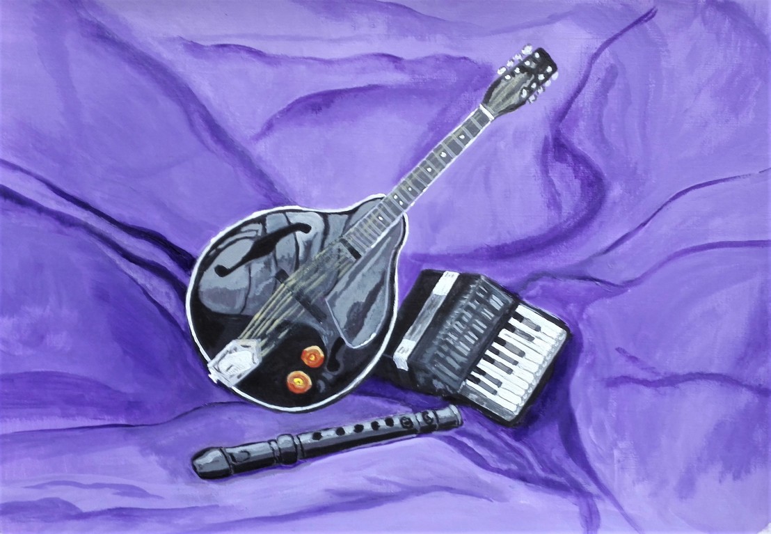
I had been thinking of trying to make a painting of musical instruments for a while and the brief for this exercise forced me into taking the plunge. My reticence was mainly due to my feeling that the complexities of the lines and shapes of the instruments would make the rendition of a good painting difficult. Could I manage to make the instruments look and feel real? How much detail should I add ? How should I group some instruments together to make an interesting composition that didn’t look too contrived? With all these questions and more I decided to proceed.
I looked at what I had available and went for three simpler shaped instruments, a mandolin, a recorder and a toy accordion. I arranged these on a chair and took a few photographs of various compositional arrangements.
The third arrangement seemed to be the most pleasing to me so I then created a background by draping an old curtain over the chair and arranged the instruments. I took two further photographs and also made two quick sketches of the composition to see how it worked on paper.
I was reasonably happy with the composition so proceeded to set about creating the painting. As the proportions and scale of the subjects was important I mapped out a simple grid and first drew the main lines and shapes with pencil then went over the main lines with white acrylic. I had chosen to use a violet ground to work upon.
I then proceeded to work up the painting starting with the darkest areas and working through to lighter parts. The photograph below shows the work in progress.
The final painting is below. I’m reasonably happy with the outcome. The positives being the mandolin itself and in particular the reflections on the body which I think look realistic. The backdrop and folds in the curtain are ok. I’m less happy with the accordion which although it looks ok and is sized correctly looks small. It is a toy accordion and therefor is small but it seems too small in the painting. Lastly my aim in my minds eye was to try to stay away from being too literal and pictorial but I did not achieve this. None the less the final picture works quite well although I’m torn between reducing the size from A3 to a squarer size so as to eliminate some of the background. I will pose this question to James when I submit my work for Assignment Two.
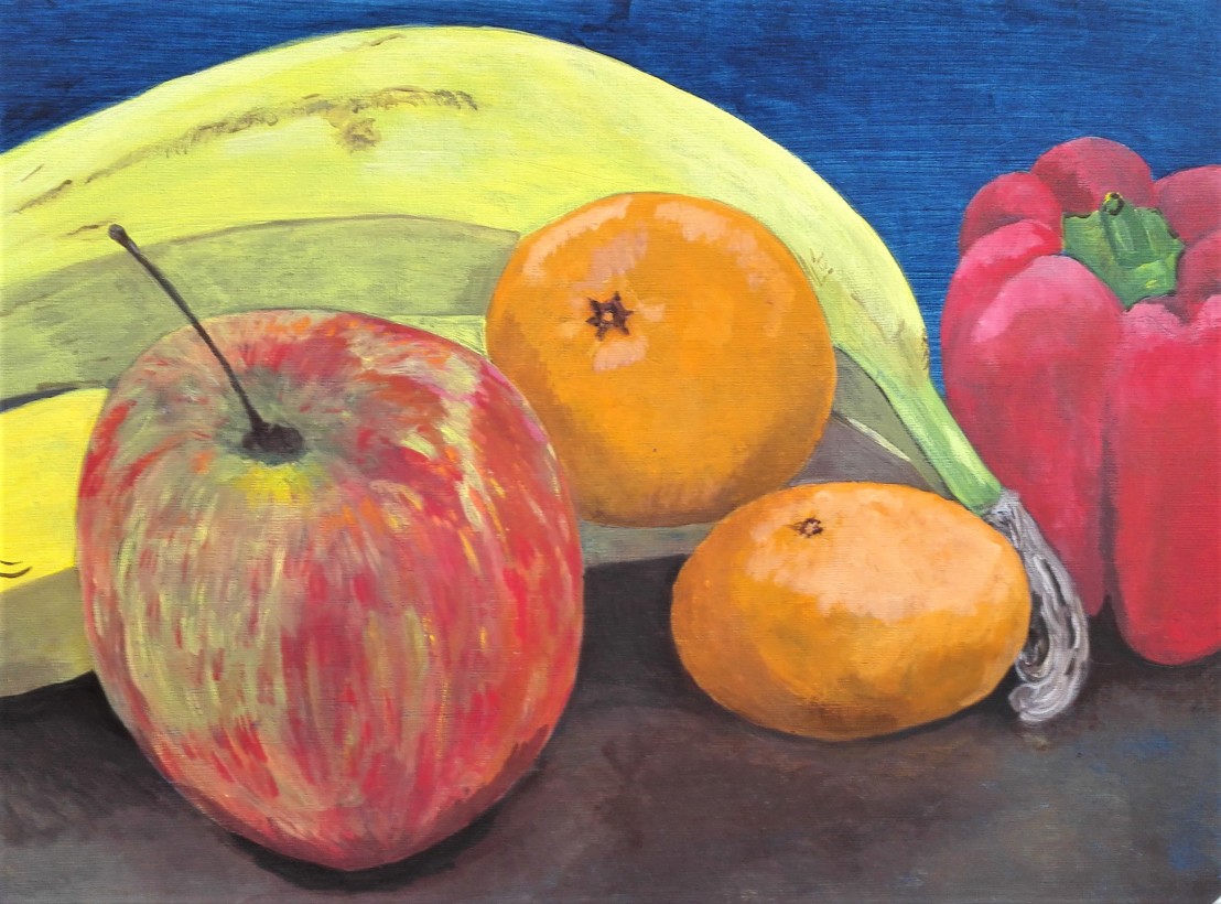
For this exercise I spent a bit more time with trying to get a pleasing composition. I arranged the fruit and pepper in a number of different ways and took both photographs and made sketches. These I looked at and thought about until I found the one that I wanted to try and paint. I decided that I would try to get in close to the fruit and to let them seep over the edges of the painting.
The photographs and sketches are shown below:
The painting I would attempt would be a combination of photograph 5 and sketch 5. I took a couple of photographs as I worked on the painting.
I had decided to use acrylics and this time to work on a Prussian blue ground. I completed the painting and was reasonably pleased with the result until I showed it to my wife and step son that evening. It was clear that one of the bananas got lost in the shadows and as a result looked unconvincing. I worked on this the following day lightening the skin in the shaded area and also painting over the background to darken it.
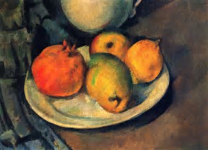
The final painting is shown below. I’m happy with the result but it is not what I had in mind when I commenced. I was looking to create a more impressionistic feel along the lines of Cezanne’s still life fruit paintings. The example below is Cezanne’s “Still Life with Pomegranate and pears” , 1890
My tendency to be more literal in my painting meant that I didn’t achieve this. Perhaps I’m setting my targets a little too high. My final painting below:
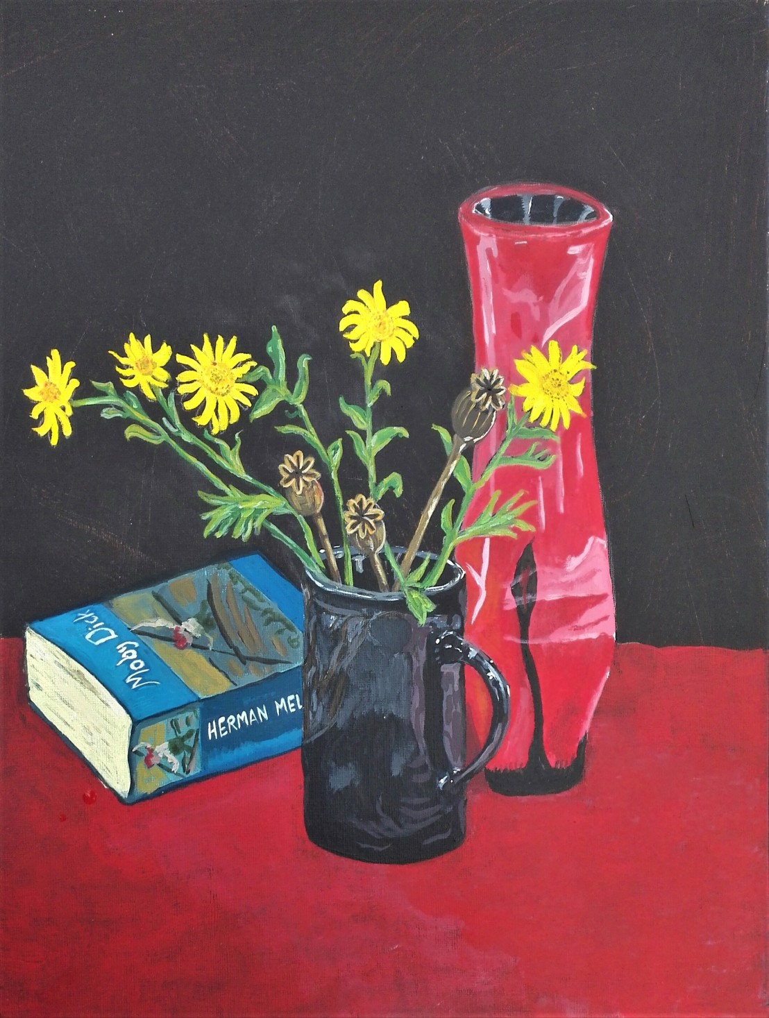
My first thoughts in looking at the brief for this exercise was where am I going to find some flowers. It is autumn and there is not a lot of flowers in the garden currently. However I did find a few daisy type flowers and arranged these with some poppy seed heads in a mug. I arranged this against a book and a vase. I first took a photograph of the arrangement to see how the image looked when framed.
Happy with the arrangement a made a few quick sketches to see how I could capture it on paper and started to think about what media I would use.
Something in between Compositions 1 & 3 looked to be what I was looking for. I decided to use acrylic paints and to create a dark ground. Dark ground created I pencilled the outline of the composition and then proceeded to work up the painting. Three of the stages are shown below.
My aim was to try to make the yellow flowers jump out of the painting and also to contrast with the red of the vase and table cloth. The final painting is below. I did need to make some adjustments to the top of the vase as the perspective was not correct. Overall I am pleased with how the painting turned out. It was close to how I had imagined it in my minds eye. The flowers do jump out at you and I feel I have managed to capture some of their life. I was also pleased with how I managed to depict the book with the cover conveyed with a few simple brush stokes. The lettering is slightly less successful as the perspective isn’t quite right. I didn’t choose to include the book Moby Dick to convey any kind of intellectual gravitas to the painting or to me. It just happened to be the book I was reading at the time. In fact I have put it down half way through as I have been finding it hard work, I tend to read late at night in bed when my brain is not at its best. Lastly I feel that reflections in both the vase and mug are not quite a convincing as the rest of the painting but I decided to resist from overworking and leave the painting as is.
I approached this exercise by making a number of sketches around the house. My aim was to try and find an interesting subject or to see something from an unfamiliar viewpoint.
The nine sketches I made are shown in order below.
I liked the simplicity of the composition with the recorder and glass viewed from below and made two sketches of this and also took a photograph to assist in the painting process.
I completed the painting and looked back at the brief for the exercise. I felt that perhaps I had missed some of what the exercise was about and had completed a painting which although it had drawing aspects to it had strayed away from what was required. I finished the painting by emphasising some of the lines which I feel detracted from the work but returned it to closer to the brief. The final painting is shown below.
I’m reasonably happy with certain aspects of the painting. I feel that is an interesting viewpoint and the linear aspects of the shelving come through. I feel that the glass lacks some subtlety, the lines make it look a bit clunky. The recorder has some perspective issues but holds interest. Overall I feel that I could have made a better painting but was trying to meet the brief of the exercise which added constraints.
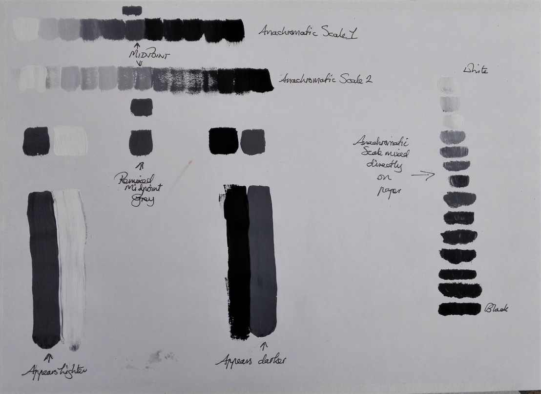
I first produced two anachromatic scales by mixing the acrylic paint and applying it to the paper. The two differed in the way the tones graded from light to dark but the midpoints or neutral greys were roughly the same. I remixed paint to achieve and close match to the mid point grey and painted two small and two larger patches of this mid point grey and compared this two pure white and blacks. On the paper itself the grey painted next to the white appears lighter and next to the black it appears darker. However this is not the case in the photographic image of the work where the opposite effect is true. Is it my eyes, perception or the tricks of photography that is having this impact? Whatever the answer is I have noted the impact of the gradual change in tones that I am able to produce by mixing paint in this way and the relationship between each tone. For the last part of this exercise I attempted a further anachromatic scale but this time mixed the changing tones directly on the paper.
Exercise – Primary and secondary colour mixing and
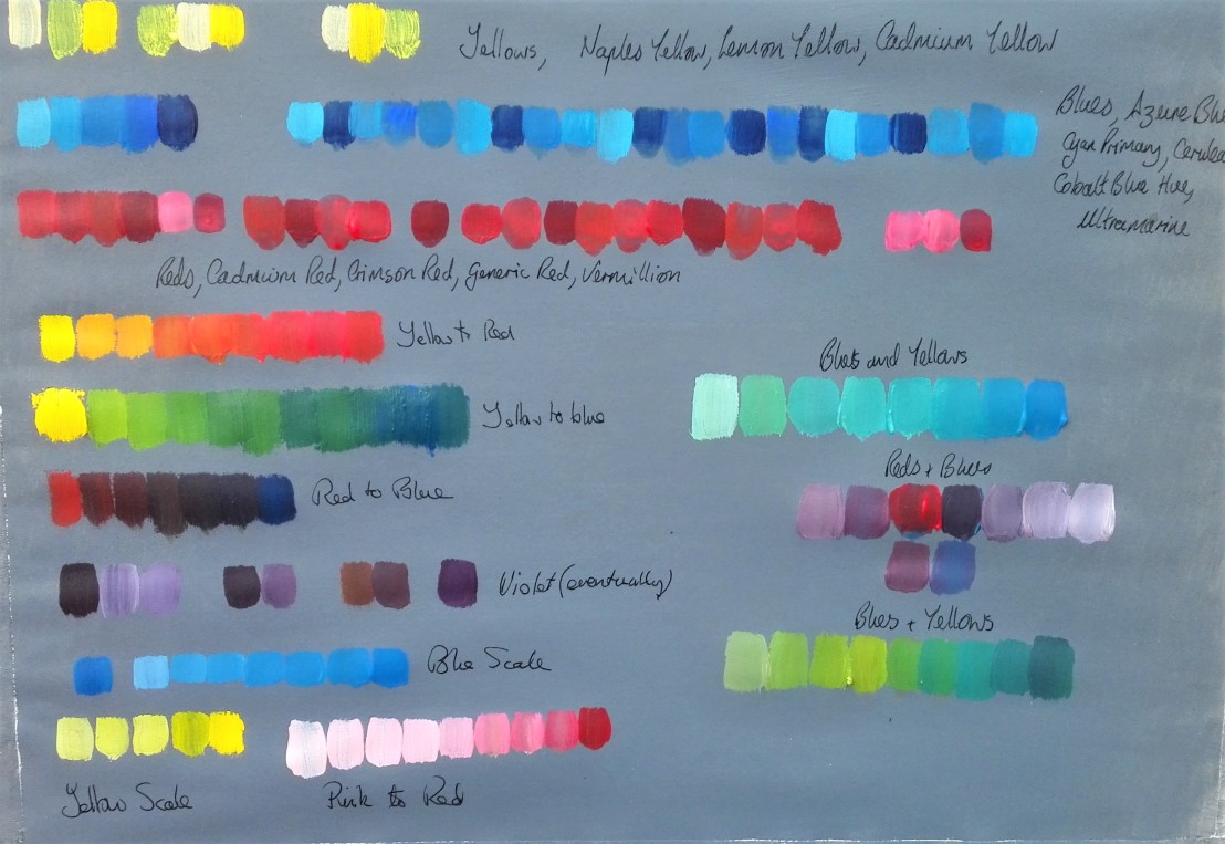
I worked through most of my acrylic primary colour paints first yellows, then blues and lastly reds. What was very obvious from this exercise was that some of the poorer quality paints produced results that were weak. This was particularly true for Lemon Yellow which looks very pale and almost translucent against the strong cadmium yellow. However I noted that this could be advantageous depending on the situation and the effect required. This observation was less true for the blues and reds. I suspect this is partly due to the intensity of these colours. I did note that my collection of primary colours was particularly low when it came to yellows.
Having completed the first part of this exercise I moved on to mixing colours to move from, yellow to red, yellow to blue and red to blue. I noted that yellow to blue and yellow to red was fairly easy to achieve by adding gradually more blue to the mix. Only a small amount of white was needed to achieve the result. With the red to blue the mix soon became quite dark and it was difficult to distinguish the colour change. Adding white helped but this colour mixing was less pleasing.
Next came the challenge of creating violet. It took a few attempts but was achieved. I found that by placing small strokes of colour on paper it was easier to distinguish the subtle changes in the colour than by observing the colour whilst mixing on the palette. Another note to self to ensure that I have some scrap paper available for testing colours when mixing them. I then made some tonal studies of the three primary colours. Lastly I made some further mixes and experimented further with the impact of adding more white to the mixes. This enabled a more gradual change in the tonal impact of the colour changes.
Exercises – Broken or tertiary colours & Complementary colours
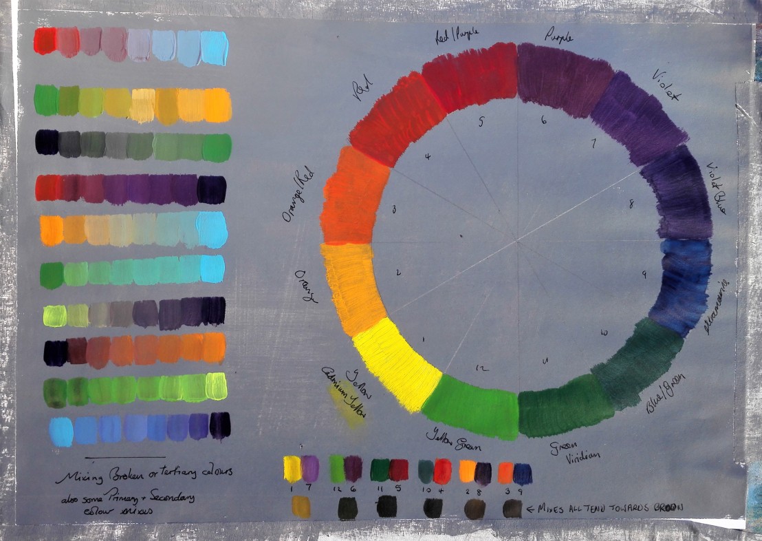
I worked through a selection of broken or tertiary colour scales and noted how the colours responded to each other and how I could manipulate the changes to achieve the results that I was looking for. I had noted during the previous exercise that colours that individually look to be a pure primary colour are often not so. For example a red often has hints of orange, a blue can tend towards green or perhaps the other way towards violet. With my limited range of yellows I didn’t notice the effect with them. This observation helped with the next part of the exercise, the colour wheel. I was careful to distinguish between an orange/red or an blue/green and not to use these as the primary colour. I completed the colour wheel and also laid out a set of opposite colours from the wheel noting their contrasts. Depending upon the brightness of either colour the contrasts was more or less significant. For the last past of the exercise I made a mix of each of the opposite colours and noted that they all became different versions of brown. Having observed this and then looking around my surroundings and thinking about it whilst out walking I that the visual world seems to be a mixture of browns and greens which is only broken up by blue sky, flowers (dependant upon season) and man made colours.
I shall keep these observations in mind and take them forward into my paintings.


 I then proceeded to work up the painting starting with the darkest areas and working through to lighter parts. The photograph below shows the work in progress.