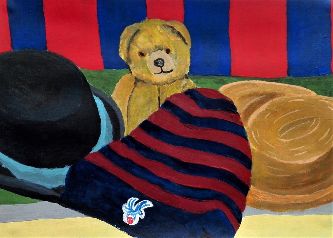
The first challenge for these three exercises was to find and set up a still life that I would find interesting and challenging. Additionally it had to be able to fulfil the constraints and demands of the exercises itself. I struggled a little to find a suitable subject before finally coming up with the idea to arrange three hats, a teddy bear and a football scarf.


I tested the final composition by making a quick sketch but didn’t feel that the set up was quite right.

I re-arranged the set-up into the composition below and made another quick sketch to test it.


I was reasonably happy with the composition and commenced on the first exercise which was to paint the still life and try to recreate the colours as precisely as possible. I set out to complete this exercise and the subsequent two using acrylic paints. I believe that some of the problems that I encountered would not have been as acute with oil paints.
I have to admit that I found achieving the precise shades of colour quite difficult. This was especially true of the bright red and blue in the scarf. I noticed that the colour on the palette was different when it had dried on the paper. The sheen and the intensity of the colour dulled. I tried to brighten the colours with the addition of white however this only reduced the intensity. My only solution was to use the colour as purely as possible straight from the tube and to overpaint so as to build up a solid colour. The broken or tertiary colours were easier to achieve although I again was confronted with the problem of the dried colour being different from that mixed on the palette.
The exercise stated not to be concerned with scale and perspective. I found these difficult to ignore and ended up creating the painting below. I feel overall that the colours are a reasonable representation of the true colours.
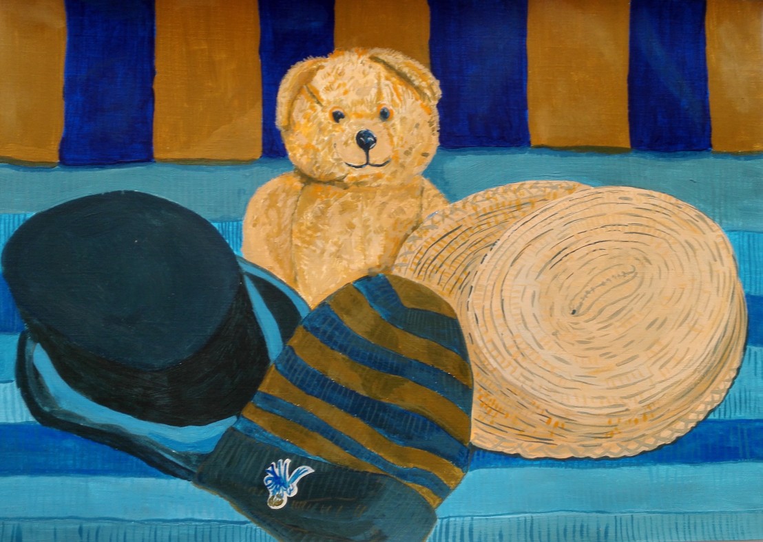
The second exercise was to paint the same still life but only using two complimentary colours. The colours I chose were Windsor Blue and Cadmium Orange. The choice of colours was partly dictated by the strong blue in the scarf and hat, but also by reference to the research I had undertaken optical effects. The painting by Piet Mondrian, Sun Church in Zeeland was painted using similar colours.

Whether I would be able to achieve a similar effect was doubtful but I pressed on. The painting below is the result. I am happy with the contrasts and the range of different hues that I was able to achieve. I am less happy how some of the colour is subdued and feel that perhaps I should have used the orange straight from the tubes a little more. I think that this may have added more drama to the work.
The third and final exercise was to paint the Still life again but this time to try to evoke mood. For this I decided that I would paint mainly using palette knife and try to use the paints straight from the tube mixing only on the paper. I used paper on which I had previously made a yellow ground. In the final painting only a tiny amount of the ground remains. The decision to use palette knife was to try to move me away from being too precise with line. The mood I was trying to evoke was a naturalistic look with a dirty feel. I think the resulting painting achieves this goal.

In summary I’m happy with my paintings for these three exercises and feel that they meet the requirements of the briefs. Most importantly they have forced me to challenge myself and my use of colour to describe a Still life composition.
