For the start of these exercise I experimented with a range of different colours and contrasts. I used my cheapest acrylic paints which were a little lacking as their coverage was poor. However I was still able to observe how the colours interacted with each other. The contrasts were most dramatic when two complementary colours were set against each other. The purer the colours the more dramatic the contrast.
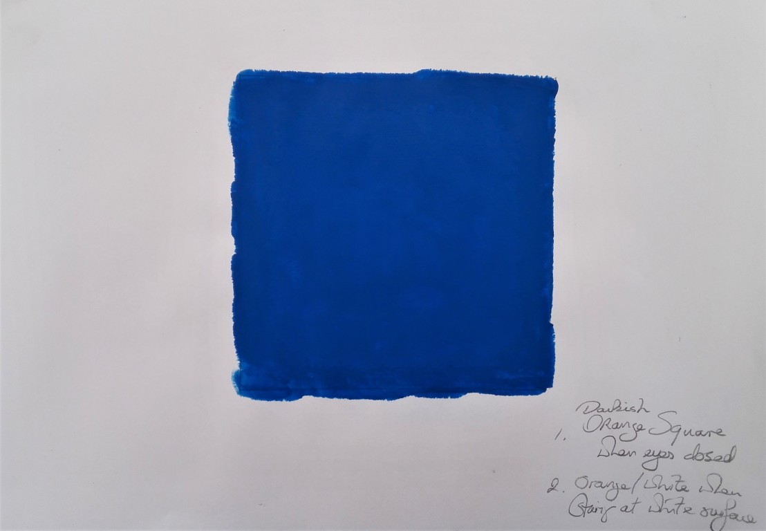
For the second of these exercises I created a square of cobalt blue and observed the effect of the optical impact of staring at the square for 30 seconds and then first closing my eyes and secondly staring at a white sheet of paper. In the first instance a darkish orange square was observed and in the second instance an orange / white image. Orange being the complementary colour of blue.
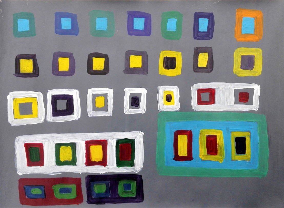
Having paint left on my palette I proceeded to paint a couple of A4 size abstract paintings the first didn’t really work and the contrasts and the marks are poor and ill defined. For the second I painted rectangular shapes of colour. The resulting painting gas hints of Mondrian.


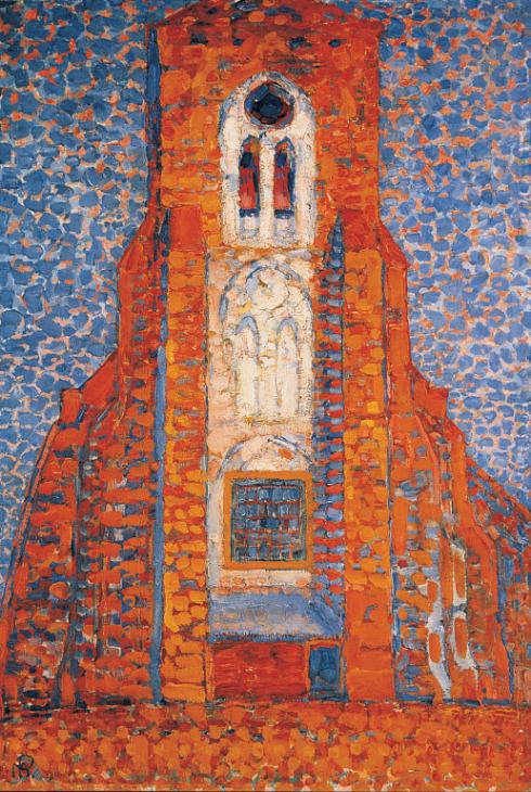
This lead me to look at other works by Piet Mondrian and I was particularly taken by a work called ‘Sun, church in Zeeland’. The painting is made using two complementary colours orange and blue. The paint is laid down in slabs. A warm feeling is created, the church glows.